Al Irshad Magazine
A refined brand identity and modern geometric Arabesque logo mark designed for a premium Islamic culture magazine.
The publication needed a modern identity that could bridge traditional Islamic geometry with contemporary editorial design, attracting both younger demographics and conservative readers.
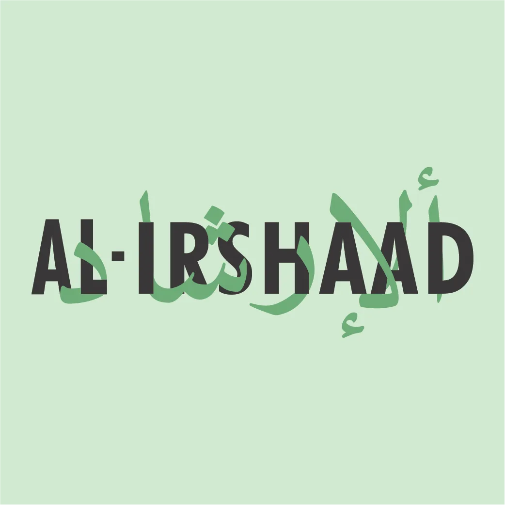
We developed a clean, geometric Arabesque logo mark combined with refined typography. The layout emphasizes balanced, negative space and vector precision, ensuring scalability across print and digital screens.
Al Irshad Magazine clean typography and logo lockup
Bridging Sacred Geometry and Editorial Modernity
The geometric structure of the logo is rooted in traditional octagonal Islamic stars, simplified to form a sleek modern mark. This creates a recognizable favicon and masthead for editorial layouts.