Dankullu Scrap Solutions LTD.
Dankullu Scrap Solutions required a visual identity that could clearly represent their role in the recycling and waste management space. The main challenges were: Communicating sustainability and recycling without using overused or generic visuals Establishing a brand that felt professional and credible, especially to corporate and institutional partners Creating a logo and identity that could scale across multiple touchpoints — from digital platforms to print and physical branding Ensuring the brand felt modern, while still grounded and reliable
We developed a clean, modern brand identity centered around clarity, symbolism, and balance. Key design decisions included: A geometric recycling mark, formed using structured shapes to symbolize renewal, continuity, and process A carefully selected color palette combining green (sustainability and growth) with deep blue (trust, professionalism, and stability) A strong, legible typography system designed for readability across both digital and print applications A minimal, grid-based layout approach to ensure consistency and scalability across all brand materials The final identity communicates Dankullu Scrap Solutions’ commitment to environmental responsibility while positioning them as a reliable and professional organization in the recycling industry.
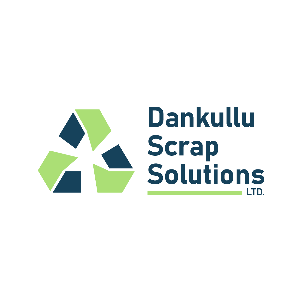
Full color logo
Overview
Dankullu Scrap Solutions Ltd. is a recycling and scrap management company focused on sustainable waste handling and environmental responsibility. They needed a brand identity that communicated trust, structure, and environmental impact while remaining modern and scalable.
The Outcome
The new brand identity gives Dankullu Scrap Solutions: A clear and recognizable visual presence Improved brand credibility and professionalism A flexible system that can grow with the company A strong foundation for future marketing and communication materials The brand now visually reflects the company’s mission and values — sustainability, structure, and impact.